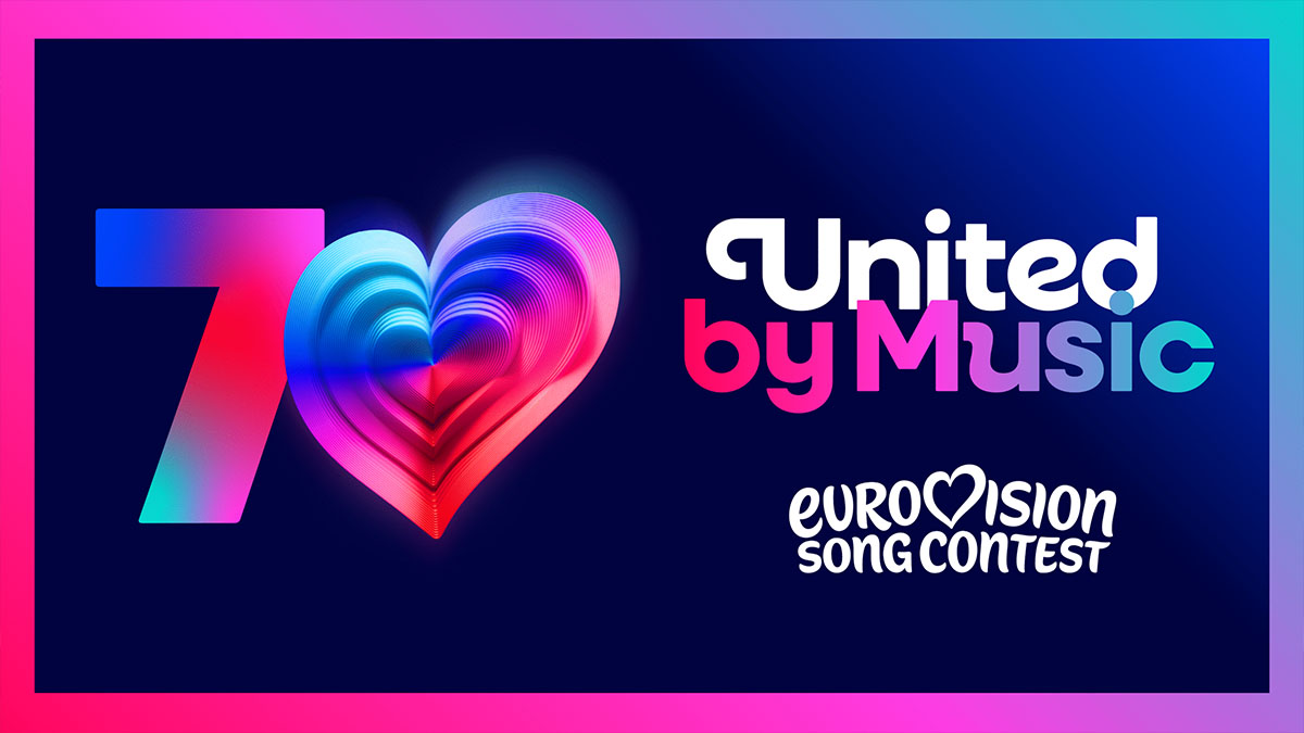
Eurovision: The EBU has unveiled a new logo for the Eurovision Song Contest. Get your first look at the fresh and spectacular design!

With excitement growing ahead of the new Eurovision season, the EBU has announced a surprising shift in the contest’s branding, unveiling a modern new logo for the beloved event. This update is more than just visual identity – behind the fresh design lie global trends and symbolic statements that chart a new path for the contest’s international brand. What does the new logo look like? What dynamics led to this decision? What secret design details have been revealed, and what are fans across Europe saying? All the answers are here.


The updated logo has been simplified into a cleaner, clearer form, with Eurovision’s iconic heart at the center – now bolder and more expressive than ever before. Alongside the logo, a new standalone symbol has been introduced: the “Chameleon Heart”. This emotive emblem reflects the cultural and musical flow of the festival, adapting to the identity of the host country, the performer, or a chosen theme – yet always retaining its fundamental place at the heart of the Eurovision spirit. The three-dimensional heart, filled with vibrancy and diversity, will play a central role in celebrating 70 years of Eurovision when the anniversary is marked next year in Austria.

The 70-year heart features seventy distinct layers, each representing a year of the contest – seven decades of music, sparkle, and unforgettable moments that have captivated audiences across Europe and beyond.

Martin Green, Eurovision’s Executive Producer, stated:

“Eurovision is an ongoing story of evolution — musical, cultural, and creative. The new design honors seventy years of success while driving the brand into an exciting future. It’s bold, full of life, and full of heart — just like the contest itself, and we are proud to share it with the world. The rebranding was designed to clarify Eurovision’s digital identity, bring all our projects under one roof, and ensure the brand remains strong for member broadcasters as the contest continues attracting new audiences globally. In the coming months, you can expect more surprises and details about the activities celebrating 70 years of unity through music”.


Watch the reveal of the new logo:


Closing the Circle? The Last Logo Change Was a Decade Ago

The last significant re-design of the Eurovision logo took place during the 60th contest in 2015, also staged in Austria. Since then, the logo has accompanied the competition for an entire decade. Now, with Eurovision’s 70th anniversary also set to take place in Austria, the European Broadcasting Union has decided to refresh and replace the logo. This move highlights a desire both to modernize and to reaffirm the contest’s core values, with music and unity at the heart of the new brand identity. Updating the logo after more than a decade also underscores the importance of keeping branding relevant and resonant for millions of viewers worldwide.

The Eurovision Song Contest has long been accompanied by a consistent logo that represents the contest’s central brand identity. The newly unveiled design by the EBU will become the official logo used for the contest in the coming years, anchored by the permanent slogan “United By Music”. In addition to this standard logo, however, each edition of Eurovision features an annually designed logo reflecting the host nation, artistic theme, or iconic elements that define that year’s show. This combination creates a unique balance: a unified brand identity that emphasizes Eurovision’s global values, paired with a localized touch that celebrates the culture and style of the host country.

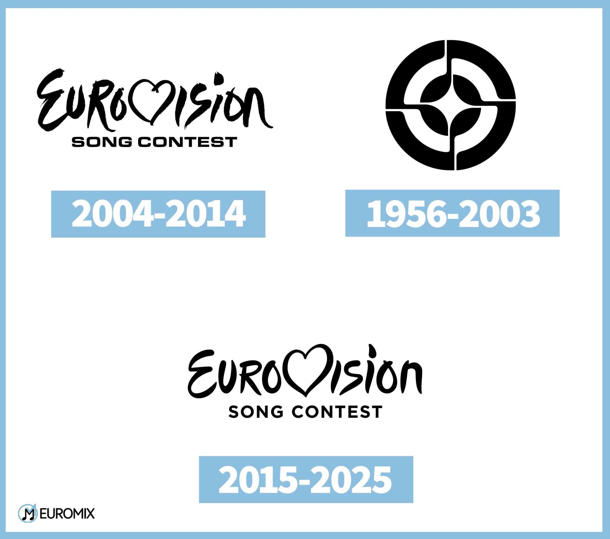
The first Eurovision emblem featured a circle with four musical notes, later transformed in its black-and-white version into a four-pointed star – symbolizing popularity and victory. The concentric circles making up the logo resembled a target, evoking the idea of achievement. In the colored version, red, white, and blue, along with dancing notes, reflected the lyrical nature of the contest as well as the values of unity and harmony through music.

From 2004 to 2014, designer JM International introduced the handwritten-style wordmark with the letter “V” forming a heart. This heart enabled each host nation to place its national flag at the center of the logo, along with its contest mascot, symbolizing recognition of its role as host. The dynamic look conveyed renewal, vibrancy, and festivity, bringing together participants and fans across Europe.

From 2015 until today, the same basic concept has been kept, though the typography was softened and refined to mark a decade of the unified logo. With smoother lines and careful spacing, the design emphasized harmony and adaptability to the spirit of the times, continuing to touch the hearts of international audiences each year.

Eurovision 2026: The 70th Eurovision Song Contest will be held in Austria, following the country’s third historic win with the song “Wasted Love” performed by JJ. This will be the third time the contest is hosted in Austria, after 1967 and 2015.