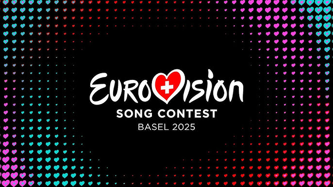
The branding and logo for Eurovision 2025 in Switzerland were unveiled last week, featuring a red heart. This design combines current trends with Swiss culture and echoes recent Eurovision messages of unity.
The visual aspect of Eurovision 2025 in Basel has been revealed as one that combines contemporary trends with an attempt to connect them to Swiss culture and echo messages of brotherhood common in recent Eurovision contests.
Art Director Artur Deyneuve is leading this year’s visual design. Similar to last year, a designer with international experience was chosen, having worked for various agencies worldwide and currently working in the host country. Deyneuve, born in South Africa and raised in Portugal, where he studied marketing, later worked as an art director in London. In 2019, he moved to Switzerland and led, among other projects, the rebranding of SWISS Airlines. This year, he was chosen to lead the design team for Eurovision 2025 as the art director.

At the center of the design, Deyneuve chose a heart that corresponds with the slogan “Unity Shapes Love”. The heart repeats to create changing and dynamic visual elements in various ways. Similar to last year’s Northern Lights/equalizer element, this year also features a repetitive element that translates well into video art and motion design, which is the “moving” and changing graphics we see in media and on screens.
The repetitiveness of the hearts creates a pixelated and dynamic look, representing the pixel trend inspired by classic computer and arcade games that have come back into fashion in recent years. The changing hearts and colors create movement and correspond with the “gradient” trend that leads many contemporary brandings. We saw an emphasis on this trend and the choice of strong, basic colors also last year in the theme and branding of Eurovision in Malmö.
The mountains we saw in all the stage simulations are also reflected in the design, especially in the movement of pixels in the moving graphics that sometimes create a mountain effect. The choice of mountains for the stage was made with the host country, Switzerland, in mind, along with the Alps that characterize it, so their continuity to the overall branding creates another connection between the design and Switzerland.
The design is also influenced by Swiss direct democracy, which revolves around constant listening and dialogue between the elected and the people. Deyneuve said:
“In the design, we tell the story of Switzerland, Switzerland is a country where we listen to each other, and if we listen to each other, we find love.”
הצגת פוסט זה באינסטגרם
The Logo
A clear correspondence of the heart identified with the general and generic logo of the Eurovision Song Contest and with the way flags are presented inside the hearts. Each year the logo is presented anew with the flag of the host country and creates uniformity over the years for Eurovision as a brand in its own right. It was first introduced in 2004, and in 2015 for the 60th anniversary celebrations of Eurovision, it underwent a slight refresh and polish, becoming cleaner and more modern. Additionally, the European Broadcasting Union (EBU) has a separate logo of its own (and it is consistently not particularly aesthetic).
The logo is composed of heart-shaped pixels that form one heart in the shape of the classic Eurovision heart. The use of red stems from the Swiss flag (white cross on a red background) and from the fact that it’s a heart and is usually represented in red. To make the pixels stand out, it was placed on a black or white background. Due to the use of pixels, there is a “readability” dilemma when presenting it on changing surfaces and backgrounds that are a solid color. For example, in the case of a sticker with a transparent background on a window, there’s a chance that “pixels” will be lost. On the other hand, the pixels have a nice movement that doesn’t look like a block or mass and will always look good in negative or in any solid color.
The choice of a heart was also made with much thought about motion design and video art (the “moving” and changing graphics we see in media and on screens). The use of the logo as a whole is not taken for granted. To create continuity, Danube uses the heart as a pixel in all shapes and elements. Similar continuity can be seen in Israel’s branding in 2019 with its star and triangles that were used extensively, but this wasn’t done as absolutely as in Danube’s branding, which represents a general trend in design regarding minimalism in the number of elements creating a unified design language.
הצגת פוסט זה באינסטגרם
The Slogan
The chosen slogan that will accompany the branding of Eurovision 2025 is “Unity Shapes Love” – which also resonates with the slogan of the previous two years (“United by Music”) and with the hearts of the branding as a symbol of love. The slogan from the previous two years hasn’t disappeared from our lives; it will continue to accompany the designs and the competition this year, but this year’s host also has a slogan of its own. Deyneuve said that the slogan was chosen because of:
“The general idea that unity shapes love, and this came from the insight that when we listen to each other, we find love.”
This insight is at the center of the design and slogan, and of course in the choice of the heart.
Last year, “United by Music” continued as a slogan from 2023 and created a certain dictate on the design approach and font choices. Until 2024, when approaching the design of Eurovision each year, the design stemmed from the logo design and slogan, so 2024 was a different year in terms of the design process. The regular process over the years began with brainstorming on the issue of what each country wants to reflect and how it wants to present itself in that year. For example, Eurovision 2019 in Tel Aviv, the slogan was “Dare to Dream” and the logo included a star with panels that formed the basis for the rest of the visual language and were also translated into the stage design. Because it was decided to keep the slogan from the previous year for Eurovision 2024, they didn’t design a special logo and settled for the slogan in bold and clear letters. This saved the initial stage of design and already dictated a specific direction to consider, and from which the rest of the design is created.
In my opinion, the freedom to choose the slogan gives more design freedom to choose the theme inspired by the words and what the host country chooses to represent. Similar to previous years, except for 2024, the design expresses the slogan. What made sense for Eurovision 2023 didn’t connect at all to the host Sweden and the city of Malmö. The wordplay on “United” from “United Kingdom,” and the unity between the host United Kingdom and the winner Ukraine made sense and connected in that year. In 2024, it didn’t fit at all and caused the design to be detached and unrelated.
This year, they gave the art director more freedom, and of course the option for the host Switzerland to add a slogan of its own. Unlike previous years, he chose the logo, slogan, and other elements in parallel and revealed them simultaneously.
The Font
The chosen font is “EuroTime” as the main font at the center of the branding. The Swiss designer Ian Party designed it specifically for this year’s competition. Party has an impressive design career, having designed, among other things, the Swiss passport. The secondary font is “SwissTime” and will be used for all running text. Both fonts visually resemble classic Swiss fonts, and we see a direct combination of local design culture. Swiss design houses are responsible for the most common font available, “Helvetica,” which was developed in 1957, and its name derives from the Latin word “Helvetia,” which is Switzerland’s official name. The designer stated that to create the font this year, they examined the last two competitions; Liverpool used a sans-serif font and Malmö used only capital letters. They wanted to change the approach this year and create a more traditional serif font that resonates with Swiss culture, without only using capital letters to avoid feeling too loud.
The use of a traditional-looking font creates contrast with modern design, thus playing on tradition and progress together. There is undoubtedly a lot of thought about how Switzerland wants to represent itself in the competition through design. We see this also in the stage design with the interplay between neon and the Alpine mountains. Even in the reveal video, there is a strong emphasis on the past, something we haven’t seen in Eurovision for a long time.
From a statement made to the studio, the font “EuroTime” will not be available for purchase and use at this time, but the secondary font “SwissTime” will be available soon.
Color Scheme
Magenta (pink), light blue, black, and red are at the center of the design, with the hearts being dynamically colored in these shades to create a gradient. The colors create a neon effect on black and dark backgrounds and respond to the trend of classic and arcade games that have gained momentum in recent years. The choice of magenta and light blue comes from the classic colors of Eurovision, black was chosen as a base color, and red represents Switzerland. The design is fundamentally different from last year’s, where the chosen colors conveyed a lot of vibrancy. Here, the designer chose to use a background—in this case, black—to make the colors pop. In various applications, only the colors are used without the black background, creating dynamic blocks of color.
The art director shared that because the design process was done relatively early this year, there were many coordination options with other production parts, including the stage designer.
Will the design age well or remain merely trendy? Time will tell. In my personal opinion, there is something that could look good as retro over the years, but it already uses retro elements, so it may be considered timeless. What is certain is that the design is more successful and original than last year’s.
Source: Logopedia, Eurovision, arturdeyneuve.com.
Eurovision 2025: The 69th Eurovision Song Contest will be held in Basel, Switzerland, on May 13, 15, and 17, 2025. The St. Jakobshalle arena, which will host the competition, is expected to accommodate about 12,000 spectators for each show. The contest will take place in Switzerland following the country’s third historical win with the song “The Code”, performed by singer Nemo. This will be the third time the competition has been hosted in Switzerland, after the contest was held there in 1956 and 1989.

