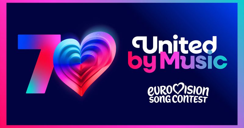
Shock! Major Branding Change for the Eurovision Song Contest
(adsbygoogle = window.adsbygoogle || []).push({});
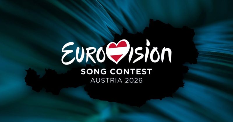
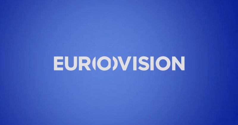
Eurovision: The EBU has unveiled a new logo for the Eurovision Song Contest. Get your first look at the fresh and spectacular design!
With excitement growing ahead of the new Eurovision season, the EBU has announced a surprising shift in the contest’s branding, unveiling a modern new logo for the beloved event. This update is more than just visual identity – behind the fresh design lie global trends and symbolic statements that chart a new path for the contest’s international brand. What does the new logo look like? What dynamics led to this decision? What secret design details have been revealed, and what are fans across Europe saying? All the answers are here.
(adsbygoogle = window.adsbygoogle || []).push({});
The updated logo has been simplified into a cleaner, clearer form, with Eurovision’s iconic heart at the center – now bolder and more expressive than ever before. Alongside the logo, a new standalone symbol has been introduced: the “Chameleon Heart”. This...


